How Apple's bento grid slides compress a keynote into 4 images
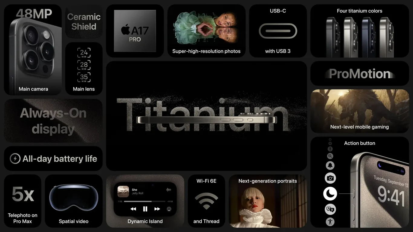
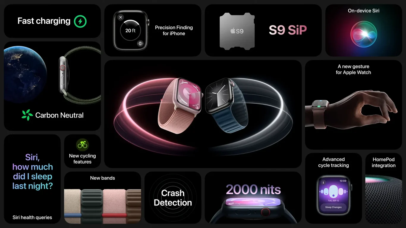
Apple's September 2023 event summary is four slides long. Each slide compresses one product (iPhone 15 Pro, Watch Series 9, iPhone 15, and the Pro Max camera system) into a bento grid: a tiled composition of differently sized cards on a black canvas, each card carrying one feature with an image, a label, and a number.
It's the format most product marketing teams have been trying to copy ever since. The version Apple actually uses is more disciplined than the imitations.
What's in each slide
Each of the four slides packs roughly 8 to 12 features into a single composition. iPhone 15 Pro covers the 48MP main camera, A17 Pro chip, titanium construction, ProMotion display, USB-C, 5x telephoto zoom, always-on display, all-day battery, and motion capture. Watch Series 9 covers the S9 chip, fast charging, carbon-neutral manufacturing, crash detection, 2000 nits brightness, all-day battery, and band styles. iPhone 15 covers the 48MP camera, 2x optical zoom, Dynamic Island, 4K60 video, USB-C, recycled cobalt battery, and ultra-wideband. Slide 4 zooms into the Pro Max camera system specifically.
A typical product brief lists features in a bulleted list. Apple's bento layout treats each feature as a tile with its own visual treatment, and that treatment is what does the work.
What works
Tile size encodes priority
Look at slide 1. The camera tile is the largest, then titanium, then A17 Pro. The smaller tiles (USB-C, ProMotion, always-on) sit at the edges. A reader scanning the slide for two seconds takes away "camera, titanium, A17," which is exactly the message from the keynote. The hierarchy isn't enforced by font size alone. It's enforced by area.
Black canvas as a non-color
Every slide uses a deep black background (#080808), which lets each tile become its own miniature design. Some tiles use product photography against transparent backgrounds. Some use solid color blocks with white type. Some use detail crops of the device. The black canvas means none of these treatments fight each other. A white or gradient background would force a uniform tile style.
Numbers are the typography
Across all four slides, the loudest type isn't a headline. It's a number. 48MP. 2000 nits. A17 Pro. 5x. These numbers are large enough to be read at thumbnail size, which is how the slides actually circulate (screenshots in newsletters, Slack channels, X posts). The text labels next to each number can be ignored without losing the slide. That's a deliberate choice for marketing slides designed to be re-shared, not presented.
Each slide tells one product story
Even though every slide uses the same grid format, the content of each slide is internally consistent. Slide 1 is "Pro": premium materials, performance, advanced camera. Slide 2 is "Watch": health, durability, brightness. Slide 3 is "iPhone 15": accessible, recycled, dynamic. Slide 4 is the camera system. There's no cross-product confusion within a slide; each one stands alone if you took it out of the deck.

What to consider
The bento grid format has a hard ceiling. Beyond about 12 tiles per slide, the composition collapses into clutter. Apple's product mix happens to fit. A company with a broader product line (a fintech with 20 features, a SaaS with 15 modules) cannot copy this format directly without reducing the number of tiles per slide. Reducing tiles usually means more slides, which usually means losing the "compressed keynote" effect entirely.
The format also works because Apple's product photography is a known quantity. A tile of titanium iPhone gleam, photographed against black, reads instantly. Most brands don't have hero photography that survives at tile size, and the format depends on that. If your product is a screenshot or a chart, bento tiles compress poorly.
The takeaway
Apple's September 2023 event slides work because the format and the content match. A keynote that just announced 30+ features needs a layout that can carry 30+ features at glance. The bento grid is that layout, and the four slides are the most efficient summary of an hour-long event you'll see this year.
If you're presenting consumer hardware, the format transfers cleanly. If you're presenting software, the format transfers but you'll need to fake your way to "tile-able" content, which usually means redesigning your hero feature shots before redesigning the deck. Compare with the September 2022 event slides (9 slides instead of 4) for an earlier and slightly looser version of the same format. Browse more marketing decks in the gallery.
Read next: the bento grid roundup, which compares this single deck against three other Apple keynote decks (WWDC '22, WWDC '23, and the Sept '22 event) and tracks how Apple compressed nine slides into four in a year.