Monzo's brand guidelines and the discipline of one color
Monzo's 2022 brand style guide is 82 slides. About a quarter of them are about a single color, Hot Coral, the saturated red-orange that sits on every Monzo debit card. The other three quarters of the document are largely a system for keeping that color from being overused.
That's the more interesting tension in the deck. A brand built on a recognizable color has to spend most of its time teaching teams not to default to it.
How the deck is structured
The 82 slides break into eight sections: introduction, logo system, color, typefaces, art direction, product mockups, identity overview, and brand codes. Color dominates. Roughly 17 slides cover the primary palette, contrast pairings, AA accessibility, the secondary palette, UI tints, and explicit don'ts. Typography then spans Oldschool Grotesk (the hero face for headlines) and Monzo Sans (the workhorse for UI), with rules for when to switch between them.
What works in the Monzo brand guidelines
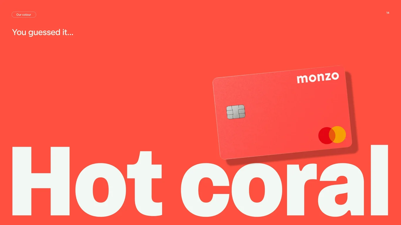
Hot Coral has a meaning slide before a hex code slide
The color reveal happens on slide 14, but the next slide doesn't list a hex value. It describes what the color represents: warmth, empathy, intuition. The hex specs come a slide later, on the primary palette specifications slide. That ordering is doing real work. Designers who understand the color emotionally tend to apply it more sparingly than designers who only know the hex code. The brand guide is converting "use this color" into "use this feeling."
The "considerate use" slide is the whole document in one page
Slide 18 tells teams that Hot Coral is exhausting at scale, and that long-form reading and product UI should default to deep navy on soft white instead. Most brand guides assume their primary color is always desirable. Monzo's openly admits theirs needs careful handling. Adverts can lean on it for attention, but websites should fall back to navy for readability. That single concession makes the rest of the document feel honest rather than aspirational.
Two AA-compliant pairings, named explicitly
Slide 19 doesn't bury accessibility in a footnote. It calls out the two pairings that actually pass AA contrast (Hot Coral with Soft White, and Deep Navy with Soft White) and quietly implies that everything else is restricted to non-product marketing. For a regulated bank where compliance touches the product surface, putting accessibility on its own slide is the right call. It also makes the rule easier to repeat in a Slack thread without re-reading the doc.
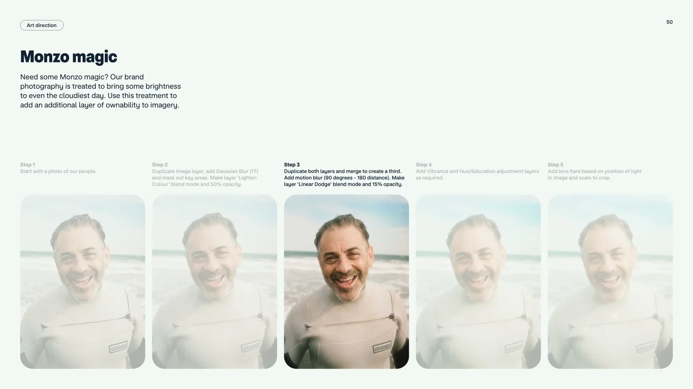
The photography treatment is named, not described
Slide 50 introduces a "special treatment": a Gaussian blur, saturation lift, and position-based lens flare applied to lifestyle photography to brighten faces and add a sunlit feel. Most brand guides describe this kind of look in adjectives, like "warm" or "optimistic." Monzo names the actual Photoshop steps. Naming the technique is what lets it scale to external agencies without drift.
Light and dark mode on adjacent slides
Slide 27 and 28 put feedback states for light mode and dark mode side by side, using the same UI components. That layout makes it impossible to design for only one mode and call the work done. For a banking app where dark mode is most of the install base, the symmetry matters more than it would for a marketing site.
What to consider
The guide leans heavily on Hot Coral as the only memorable visual element. The secondary palette (mid orange, pale pink, neon yellow, mid teal, pale blue, deep khaki) is introduced on slide 20, gets one application example on slide 23, and then mostly disappears. In practice, this means the brand looks identical to itself everywhere, which is good for recognition but limits how much expression marketing can layer on for individual campaigns. Compare to systems like the OpenAI brand guidelines, which build out 30 color themes from a B&W foundation specifically so that designers have room to work.
The art direction section (slides 41 to 56) is the weakest part of the document. It repeats the same idea across more than ten slides without much in the way of concrete instruction. The single most useful page in this section is the special-treatment recipe on slide 50. The rest could compress to two or three slides without losing anything.
The takeaway
Monzo's brand style guide is a masterclass in restraint disguised as a color document. The Hot Coral system is what gets attention, but the operationally useful parts are the rules for not using it: the "considerate use" guidance, the named AA-compliant pairings, the photography treatment specified as a technique rather than a vibe, and the symmetric light/dark feedback-state mockups.
If you're working on a brand guideline for a product with a strong primary color (fintech, consumer, anywhere a single hue does most of the work), Monzo's deck is the reference point. The interesting page numbers are 14 to 15, 18 to 19, 27 to 28, and 50.
Read next: the Frame.io brand guide breakdown — the third in the brand-guideline trilogy on this blog, alongside this post and the OpenAI guide. Frame.io makes the opposite trade: instead of one disciplined primary color, the system descends from one environmental observation about its audience.