OpenAI brand guidelines: an empty vessel for content
The most quoted line in OpenAI's 2022 brand guidelines, prepared by AREA 17, comes early on. OpenAI is an empty vessel that adapts to its content. That single framing decides almost every visual choice that follows: pure black and white as the primary palette, a heavily restrained type system, photography that prioritizes warmth and softness, and 30 designer-curated color themes that exist as a pool to dip into rather than a default to apply.
It's an unusual position for a tech company to take. It's also the most copyable idea in the document.
What's in the OpenAI brand guidelines deck
The published gallery selection is 17 slides pulled from the longer document. The full guideline (108 slides) covers logo construction, lockups, clear-space rules, color, typography, iconography, photography, and a full data-visualization framework with WCAG contrast and chart-spacing specs. The 17-slide cut focuses on the parts that explain why the system looks the way it does:
- Cover and AGI mission statement
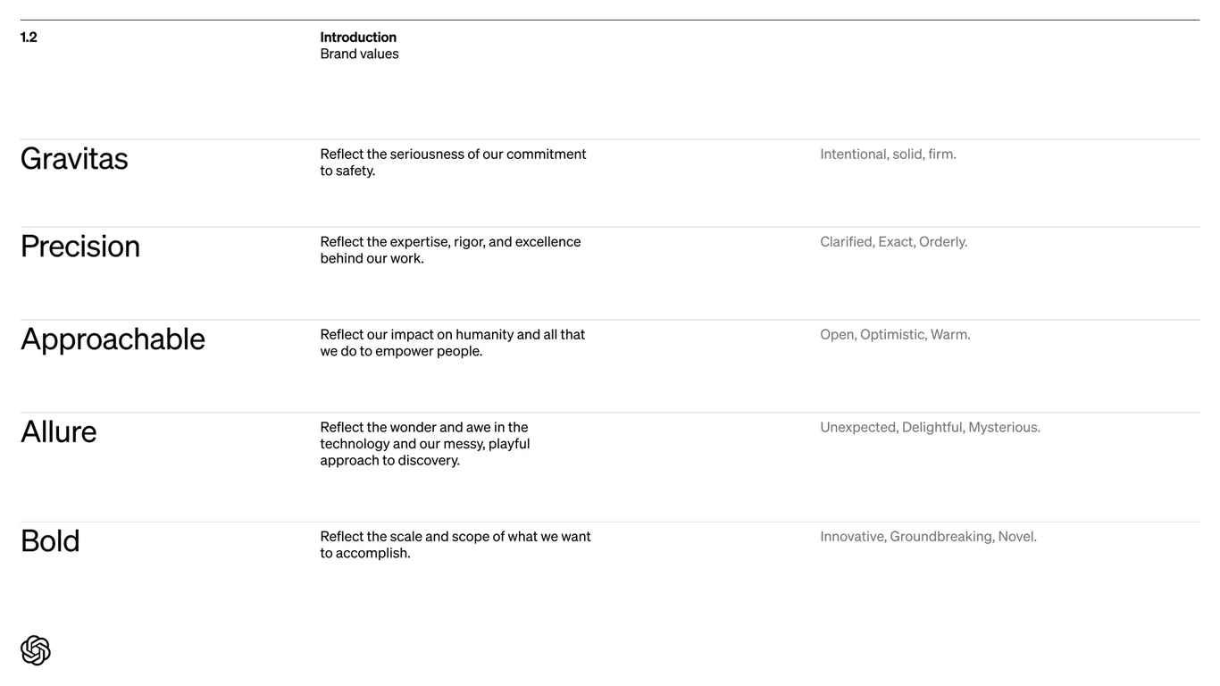
- Five brand values: Gravitas, Precision, Approachability, Allure, Bold
- Logo on black-and-white backgrounds
- The "empty vessel" color philosophy
- Black and white as the primary palette
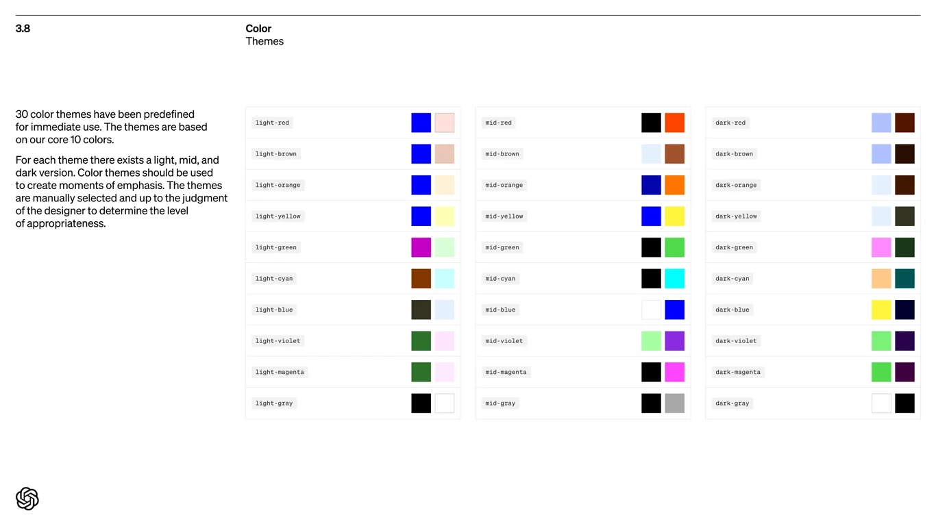
- Thirty color themes (light, mid, dark) built from 10 hues
- Signifier (serif) and Söhne (sans) as the type system
- Iconography construction rules
- Photography principles
- Data visualization standards
What works
The brand starts with a mission slide, not a logo slide
Slide 2, our mission is to ensure that artificial general intelligence benefits all of humanity, comes before any visual rules. That sequencing makes every later constraint feel mission-derived rather than aesthetic. When the deck later says the logo should not be tilted or stretched, the implicit reasoning isn't "because it looks bad" but "because gravitas requires precision."
Five brand values that map to design choices
Most brand decks list values that are too abstract to apply (innovative, customer-first, etc.). OpenAI's five values, Gravitas, Precision, Approachability, Allure, and Bold, are written specifically so a designer can ask, does this comp feel allure-y enough? Approachability is what justifies the warm, slightly imperfect photography direction. Precision is what justifies the tight type weights. The values do real work.
The empty-vessel framing
Slide 8 ("OpenAI is an empty vessel that adapts to its content") is the document's central decision. By committing to pure black and white as the primary palette, OpenAI gets a brand that disappears behind whatever it's hosting (research papers, product UI, partner work) without ever clashing. The 30 color themes on slide 10 exist because black and white is the default. Themes are how a designer adds back temperature when the content needs it.
Restricting the type system to four faces
Slide 13 lists the entire approved type set: Signifier Light, Söhne Buch, Söhne Halbfett, and Söhne Mono. That's it. Most type systems for tech companies include 6 to 10 weights and at least one display variant. OpenAI strips it down to a serif for long-form, two sans weights for everything else, and a mono for technical contexts. The constraint is what makes the brand identifiable in a screenshot. You can spot OpenAI typesetting at thumbnail size.
Iconography matched to type weight
A small detail on slides 14 to 16. Icon stroke weight is paired to typeface weight: 1.4px strokes pair with Söhne Buch (400-weight), and 2px strokes pair with Söhne Halbfett (500-weight). When icons sit next to text, they vertically align inside the cap height, not the line height. That's the kind of rule that no designer thinks to articulate until they've seen icons floating awkwardly next to body copy 50 times.
What to consider
For an AI company, the AI generated imagery slide is the most cautious section in the deck. The full guideline says DALL-E is acceptable for non-photo-real or abstract assets but warns explicitly against generating photoreal people. That position dates the document. It was written in September 2022, before the broader generative-image debate, and is notably restrictive for a company that ships the underlying model. It would read differently today.
The data visualization section is dense and mostly defensive (pixel measurements for chart padding, four-line maximum for line charts, 24px label clearance) but doesn't include a single example of OpenAI's signature loss curves or scaling laws charts. Those are the data visuals OpenAI is actually known for, and the absence is telling.
The takeaway
OpenAI's brand guidelines treat the brand itself as a vessel for content. That commitment makes the document unusually internally consistent. Every rule traces back to either the AGI mission or the empty-vessel philosophy. For any company building products on top of generative models, where the output is the brand more than the brand is, the OpenAI deck is a useful reference. The pages worth bookmarking are 2, 5, 8 to 10, and 13.
Compare it with the Monzo brand style guide, which solves the opposite problem: how to keep a single recognizable hue from overpowering everything. Or browse more brand guidelines in the gallery.
Read next: the Frame.io brand guide breakdown, which closes the trilogy alongside this post and the Monzo breakdown. Frame.io picks neither restraint nor empty-vessel — its system descends from a workplace observation about its audience.